EAT GNARLY


Brand Identity • Packaging Design • Environmental Graphics
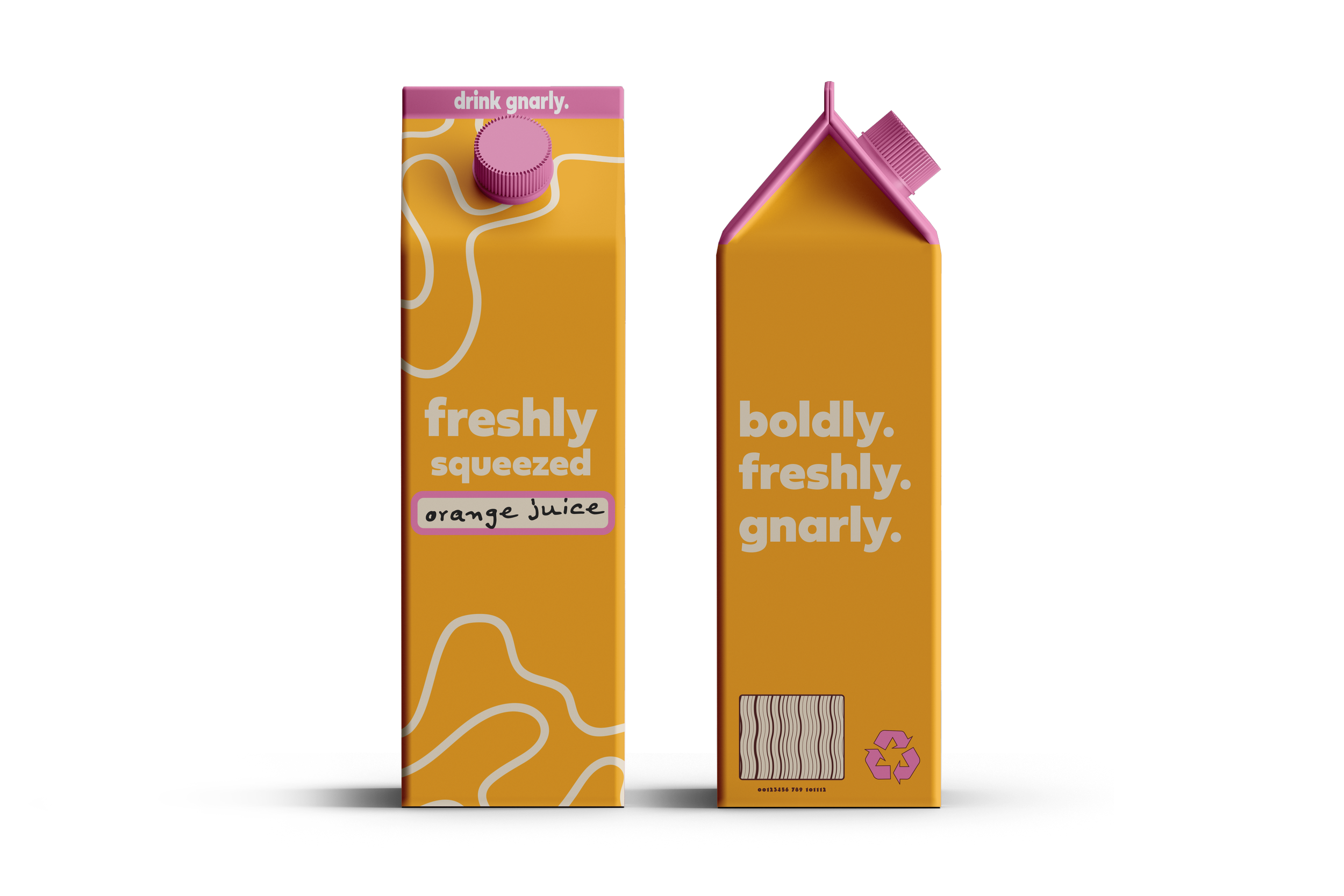
Gnarly Eats is a full-flavored slice of Rhode Island, a market and food stand grown from the roots of Gnarly Vines Farm. Their vibe is no-nonsense ingredients, unapologetic typography, and design that hits as hard as their garlic fried chicken and Brazilian flavors. I leaned into lively letterforms, high-contrast color combos, and patterns that capture the sizzle of a food truck built by pastoral farmers turned creators.
From logo to packaging to signage and social graphics, every piece lives with personality. Flavor names crack a smile, ingredient illustrations feel hand-spun, and layouts stand out in any food market. The identity turned Gnarly into a standout, quirky anchor of its community, where every design decision tastes intentional and real.